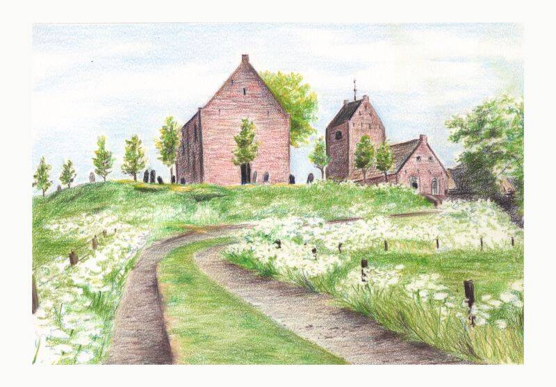
Earlier this week I made this sketch in my sketchbook. It is the old church of Ezinge. Ezinge is a tiny village in the North of the Netherlands. The church and it's tower beside it, were built on a "wierde" in the 13th century. A wierde or terp is an artificial dwelling hill. The hills were created for keeping cattle and people safe if the nearby sea and/or rivers were flooding. Ezinge was constantly inhabited since 600 BCE and probably earlier, making it one of the oldest towns in Europe. The village is only 12 km away from my house and easy for me to visit by bicycle.
I made this sketch from a photo though. Working in coloured pencil is not something I like to do when going outside. I love layering colours and that takes time. A little while ago someone asked me about the brands of pencils I use and which ones I prefer. My answer was a bit long. Because for me it makes a big difference if I do detailed work (botanical for instance) or a landscape like this. For detailed and small work you need sharp pencils. They should not be too soft because you will lose the sharp point immediately. Because you need a sharp point is better to use pencils with thinner leads. So many great brands like Derwent and Caran d'Ache have created beautiful pencils in the past decades. But they are useless for detailed work because they are too soft and to broad.
Another big issue for me is Lightfastness. I have many old drawings in coloured pencils that have shifted colour. When I started working with coloured pencils, I didn't wonder or worry about that. It was never mentioned on the pencils nor did the brands bother to reveal such information. So when I now use coloured pencils I use only lightfast ones. Especially when it comes to work that needs to be framed or sold. For a sketchbook drawing it is not very important of course.
So to conclude this little lesson in coloured pencil, I can tell you that for detailed fine work I use mostly Faber-Castell Polychromos. For landscapes I use them too but I can combine them with the Derwent "Drawing" and "Lightfast" pencils. And I like the colours (especially the very lightest colours) of the Caran d'Ache Luminance 6901 pencils.
The sketch is made in a Rhodia Touch sketchbook. But not the best paper for coloured pencil. This was in the Pen & Inkwash sketchbook. That paper is like bristol and too smooth for this medium. I chose not to burnish or blend the layers. So the look is a bit rougher than my usual pencil drawings.
Add comment
Comments